Identity · Exploration
SCG.
Six directions for a stylised S-C-G monogram in a clean wordmark style. The crown and line elements from the current mark are gone — they read as decorative, and the new positioning is anything but.
The approach
All six concepts use the same underlying letterforms: geometric S, C, and G built from straight segments with 45° cut corners, at a single uniform stroke weight.
The chamfer is doing real work. It reads as cut steel and as technical drafting at the same time, which is exactly where this business sits. It also means the letters are drawn as paths rather than set in a typeface — the mark never depends on a font being installed, licensed, or loaded, and it will reproduce identically on a business card, a truck door, and a report cover.
What changes between concepts is the container and the supporting structure, not the letters. That keeps the family coherent whichever one Jesye picks.
Concepts
Six directions.



Recommendation
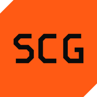
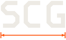
01 Plate, with 05 Chamfer as the wordmark.
Use them as a pair. Plate is the icon — the thing that survives at 32 pixels on a phone, on a truck door at forty feet, and as a favicon. Chamfer is the horizontal wordmark for letterheads, report covers, and email signatures.
They share identical letterforms, so nothing has to be redrawn and nothing drifts out of sync. If Jesye wants more warmth, 03 Rule is the alternate — it says "we measure things" more explicitly, at the cost of some legibility below about 40px.
Ink · Bone · Amber — all three reproduce in one colour
Lockups
How it sits with the name.
Two lockups cover everything. Horizontal for headers, signatures, and anywhere wide; stacked for square formats, covers, and merchandise.
Colour
Two surfaces and one accent.
The system alternates between ink — the field — and bone — the document. Amber is the only accent and it is used deliberately: hazard orange earns attention precisely because it is rationed.
Typography
Expanded, not condensed.
Every construction company in America uses a condensed grotesk. Archivo pushed to its expanded width does the opposite — it reads modern and technical rather than rugged, which is the correct register for a consulting practice.
Archivo
Width 116 · Weight 800
Uppercase · −0.022em
Hire the expertise
Archivo
Width 112 · Weight 750
Uppercase · −0.015em
Four ways to work together
Archivo
Width 100 · Weight 400
Sentence case · 1.62 line height
You are not paying for hours. You are paying to reduce risk, prevent expensive mistakes, and make a better decision than you would have made alone. A two-hour consultation that catches a $14,000 omission has returned its cost many times over.
JetBrains Mono
Weight 500
Uppercase · 0.16em · Tabular
Tier 01 · Investment · Deliverables
$227 $997 $1,997 $3,500
Usage
Clear space, minimum sizes, and what not to do.
Clear space
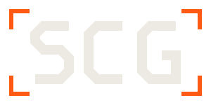
Keep a margin equal to the height of the letterforms on all four sides. The dashed line below marks the boundary — nothing crosses it, including page edges, photographs, and other logos.
Minimum sizes
Below these, the letterforms close up and the chamfers stop reading. Use the favicon variant instead, which is drawn heavier for exactly this reason.
Don't.
The mark is simple enough that most damage comes from adding to it.
- Don't reintroduce the crown or the line elements from the previous mark.
- Don't add a drop shadow, bevel, outline, or gradient. The chamfer is the dimension.
- Don't stretch, condense, or rotate the letterforms — the widths are drawn, not typed.
- Don't set the mark in amber on top of amber, or ink on top of ink. It needs the contrast.
- Don't place it over a photograph without a solid plate behind it.
- Don't recreate it by typing S, C, G in a typeface. Use the supplied files.
- Don't round the corners. There is no border-radius anywhere in this identity.
Next step
Pick one and it gets refined.
Once Jesye chooses a direction, it gets tightened, outlined properly, and delivered as a full asset pack — SVG, PNG at several sizes, one-colour and reversed variants, favicon set, and social avatar crops.